来源: 吾推网
发布时间: 2018-03-27
次浏览
html部分:
<div class="triangle"></div><br/>
<div class="triangle1"></div><br/>
<div class="triangle-up"></div><br/>
<div class="triangle-down"></div><br/>
<div class="triangle-left"></div><br/>
<div class="triangle-right"></div><br/>
css部分:
.triangle{
height:100px; width:100px;
border-bottom:50px solid red;
border-left:50px solid #006633;
border-right:50px solid blue;
border-top:50px solid yellow;
}
.triangle1{
height:0px; width:0px;
border-bottom:50px solid red;
border-left:50px solid #006633;
border-right:50px solid blue;
border-top:50px solid yellow;
}
.triangle-up{
height:0px; width:0px;
border-bottom:50px solid red;
border-left:50px solid transparent;
border-right:50px solid transparent;
}
.triangle-down{
height:0px; width:0px;
border-top:50px solid red;
border-left:50px solid transparent;
border-right:50px solid transparent;
}
.triangle-left{
height:0px; width:0px;
border-bottom:50px solid transparent;
border-top:50px solid transparent;
border-right:50px solid red;
}
.triangle-right{
height:0px; width:0px;
border-bottom:50px solid transparent;
border-left:50px solid red;
border-top:50px solid transparent;
}
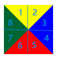
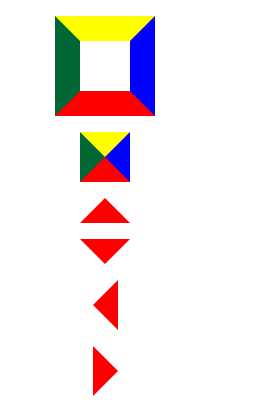
以上样式生成的图形:
第一个图形是一个100px的正方形加50px的4条边距
注意四条边相连的地方
现在让我们把正方形设置成长宽为0
也就是第二个图形
有没发现出现了4个三角形
其实这四个三角形分别就是4条边框相连形成的
接下来我们就要让css3的transparent(透明属性)出场了
我们只要设置其他3条边的边框颜色为透明或无
那么一个三角形就出现了
如第三个图形就是设置了
左右边框透明,上边框无
按照这种思路
我们可以用纯CSS绘制如下图
8种方位的三角形